Online
Donation Form
Boosting online fundraising with a sleek donation form.
- Client
- KindLink
- Location
- London, UK
- Year
- 2018
- Work
- Product Design, UX Research, Information Architecture, UI and UX Design, Prototyping, Animation, Content Definition
01. Complexity.
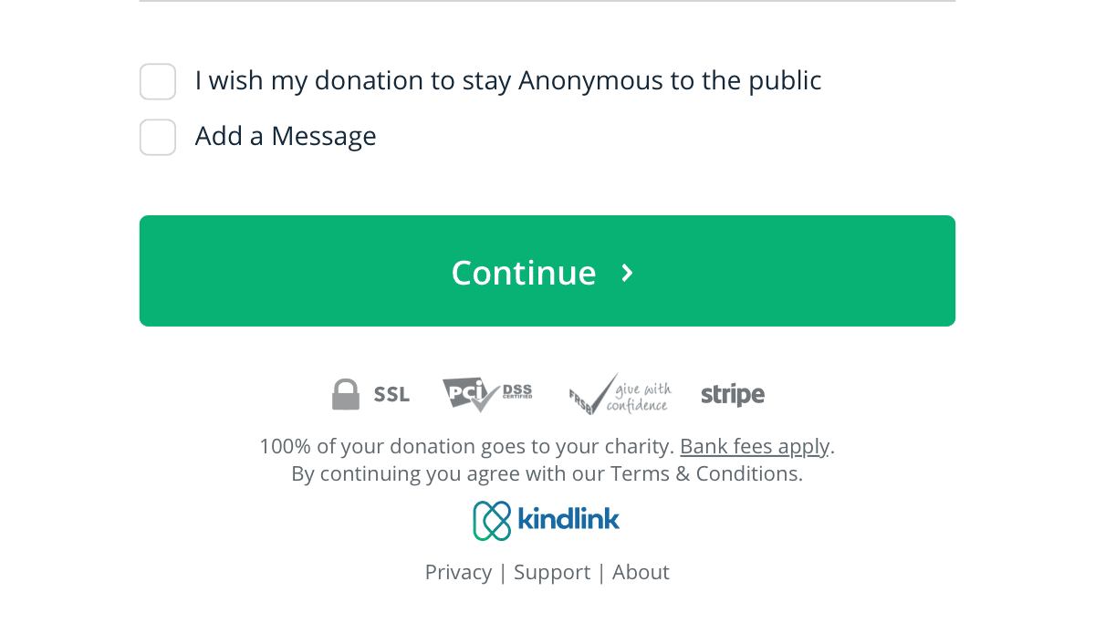
Charities want to know as much as possible to feed helpful data to their CRMs. Users hate filling out long forms, they want to be entertained, have a positive experience and be done with the process quickly.
Oh, and GDPR regulations were on the horizon with very strict rules about personal data and allowed for no excuses hidden in privacy policies – we had to explicitly and clearly ask for consent for each piece of personal data collected.
02. Short or Long?
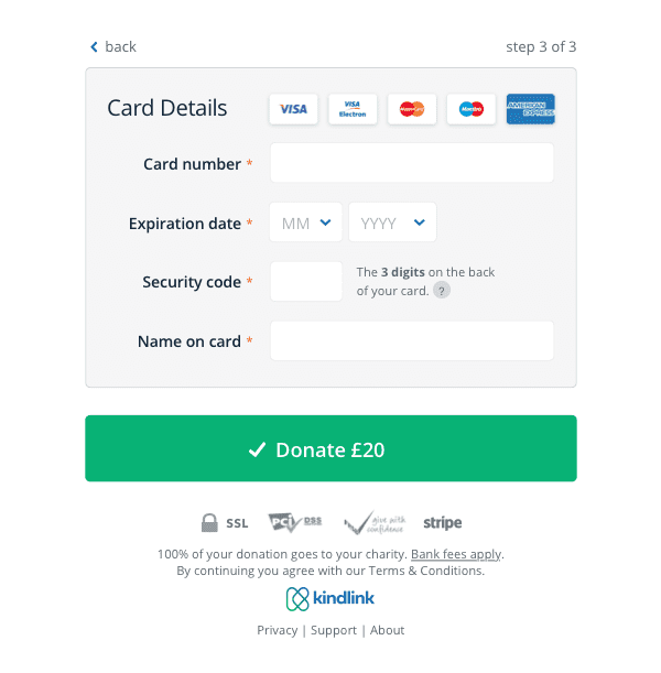
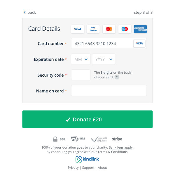
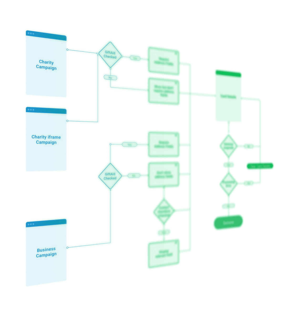
There’s no shortage of donation and buying workflows, but I was aiming for a streamlined, user-friendly approach. Going through tons of forms was crucial to gaining insights on the best experiences, flows and optimisations and come up with the clean and concise solution
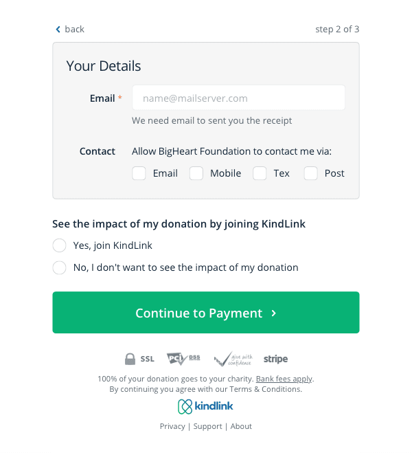
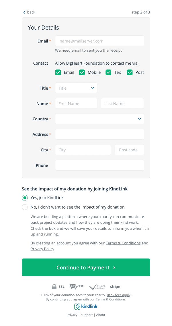
Balancing between complex requirements is where creative solutions pop out. Users want clear and short form – check. Charities get the option to get details from helpful users – check. Regulatory compliance – check.
03. Have Some Fun.
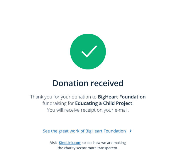
Well, it’s not fun like watching Netflix, but I spent a lot of time crafting an experience that was joyful even during the few seconds the user was waiting for his payment to be verified.
